What is the ideal Facebook Cover Image sizing?
Your Facebook Page’s Cover photo displays at 820 pixels wide by 312 pixels tall on desktop or laptop computers and 640 pixels wide by 360 pixels tall on smartphones.
To get the composition right and to avoid cropping of key elements, your main content should stay within an inner bounding box of 640px wide by 312px tall.
Recently I noticed that one of my valued clients uploaded an image into the Facebook Cover Image that wasn’t quite right.
For those of you who are not sure what I’m talking about, it’s the feature image at the top of your Facebook Page, not your Profile image.
Here’s where I mean:
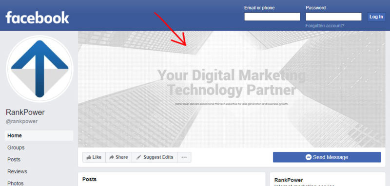
Now the tricky thing is that the shape of this image that’s visible in Desktop vs the shape visible on Mobile is different.
How is this an issue?
Put simply:
- On Mobile, you loose some of the sides of the image with cropping.
- On Desktop, you loose some of the top and bottom of thr image with cropping.
This is a problem if the content in your image maybe contains some text, a value proposition, or a key element that you don’t want cropped, or that looks bad if it’s right up against the side. Heads get cut off and all sorts!
I thought it might be handy to provide you with this guide, and give you the exact file I use as a template to get it right.
Here’s the result I want on desktop. It measures 820px wide by 312px tall:

Here’s the result I want on Mobile. It measures 640px wide by 360px tall:

Here’s what the mobile version looks like on an actual device. Take special note of the cropping from the left and right sides, and a bit of extra space at top an bottom compared to the desktop version.
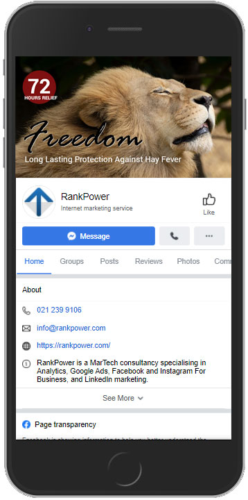
To make those both work, I need an image that looks like this. It measures 820px wide by 360px tall (the two largest dimensions of width and height of the two sizes I need):

Here’s that same image with guidelines on where it’s cropped. You’ll see to make the image work for both screen types, I have to keep all of the required content within the smallest boxed area that will work for both screens. Keep this in mind when you’re creating your content.
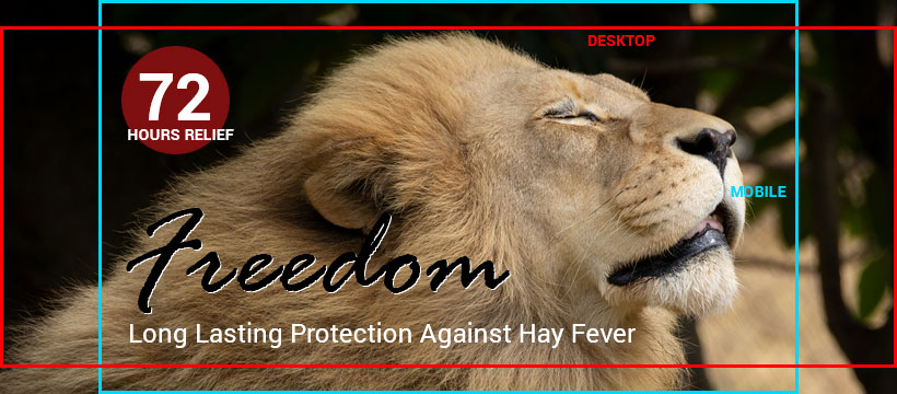
Now feel free to download the template. I have it here in JPG too in case you don’t have the software. Just remember to stay within the inner box.
How we can help support your Facebook Marketing:

